
Investigating Global Warming

New Graphing Technique shows no long-term global warming.
Came across this interesting way of viewing all possible trends on global temperature changes. (Lines with a slope of -1 all end in the same year). Of course, the original data-set is important; it will determine the resulting contours/colors.
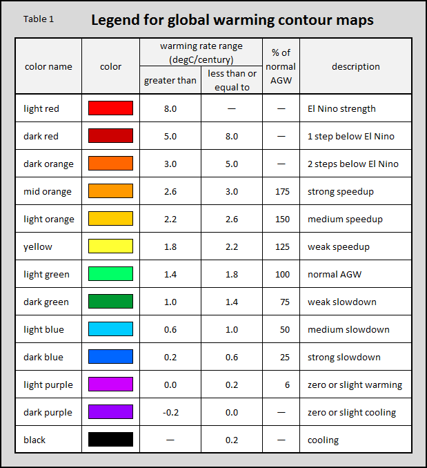
Essentially, when considering any trend length over the last 130 years, there has been no significant upward trend in global temperature lasting more than 5-10 years (trend length on Y-axis measured for the 'red fireballs' across the X-axis).
- Any upward trends (red, yellow, and light green colors) are always cyclical, lasting only 5-10 years and are followed again by cooling (purple or black gaps).
- Over the long term 'the large blue areas' show that most long term changes are below what was predicted (light green = normal AGW).
- The 'light green triangle' created between 1970-2015 suggest that the temperature has increased since ~1960 (light green), but longer trends show that the increase is small compared to 1880 (light and dark blue region).
- The graph also suggests we can expect it to get warmer in the next five years (looks like we are about half-way through another red ball on the bottom right corner), likely followed by another (not-surprising) cooling event.
- The heating events seen in 1910, 1940, 1975 and 1995 took longer to dissipate (they stretch higher into the plot).
- There is a large black cooling event in 1940.
- Any acceleration in warming would show as red streak of slope -1. There aren't any, so, the temperature increase is steady over the long term.
- If AGW were true, should we see a light-green triangle starting at the industrial revolution (early 1800s)? The plot suggests that nothing much happened until ~1960 when things suddenly got warmer...doesn't exactly support the 'A' in AGW...
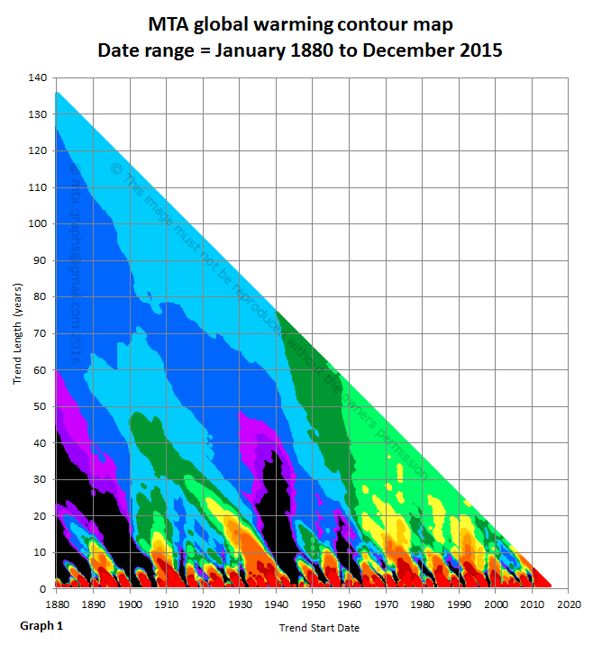
Global temperature trend contour map
Investigating Global Warming
![]() Reviewed by Unknown
on
11:41 PM
Rating:
Reviewed by Unknown
on
11:41 PM
Rating:
No comments: